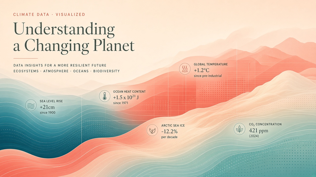
Standard climate charts communicate trends accurately yet often fail to motivate action because global warming feels psychologically distant. Researchers at the University of Bologna and University of Florence developed a Human-AI Collaborative (HAIC) eco-visualization workflow that blends generative imagery, semantic segmentation, and scientifically curated color palettes to translate datasets such as IMF climate indicators into evocative art. A 2025 workshop paper, "From Data to Narrative: Visualizing Complex Phenomena through Human-AI Co-Creation," presented at HAIC 2025 in Bologna, describes a web application where scientists and activists without design training co-create visuals that balance emotional resonance with encoded metrics. Teams exploring AI image generator tools for advocacy or scanning popular AI tools for creative workflows can learn from this designer-scientist model rather than treating generative AI as a one-click poster factory.
Why Charts Fail to Motivate Climate Action
Line graphs and anomaly maps excel at precision but weakly address psychological distance, the sense that climate change happens elsewhere or in the future. Communication research shows that abstract statistics rarely trigger the emotional engagement needed for behavioral change, especially among audiences already aware of the science but feeling eco-powerlessness. University of Bologna HCI work on sustainable action documents a knowledge-action gap among students who understand crisis headlines yet doubt individual relevance. Traditional dashboards prioritize legibility for experts, not narrative pull for public audiences or policymakers scanning social feeds.
Unconventional visualizations, including artistic-scientific hybrids and metaphorical compositions, can reduce distance when they connect data to places, seasons, or cultural symbols viewers recognize. The risk is losing fidelity: a beautiful image that mis-encodes temperature thresholds becomes misinformation. Eco-visualization therefore requires semantic control, not raw prompt-to-image generation alone. The Bologna-Florence team positions HAIC systems as partners where humans retain interpretive judgment and AI supplies segmentation, palette application, and generative variation under constraints.
Psychological distance research on personalized climate imagery suggests locally grounded visuals can increase perceived immediacy of impacts when viewers recognize familiar geography or livelihoods. The Bologna group's co-design workshops with university students on SDG visualizations confirm appetite for hub interfaces that translate institutional metrics into vivid objects such as trees, water bottles, or bird counts rather than abstract percentages alone.
Mapping CO2 Data Onto Generative Scenes
The HAIC pipeline segments base imagery, overlays domain-calibrated color scales, and binds numeric climate indicators to visual regions so each hue carries defined scientific meaning. Large language models can propose unconventional layouts, but LLM-only outputs often mishandle color semantics, treating red as decorative rather than as a threshold for emissions intensity or temperature anomaly. The EcoVisualization research line addresses that by combining generative models with algorithmic segmentation and curated palettes tied to sustainability communication standards developed at the University of Florence architecture department.
Practitioners start from datasets such as national CO2 trajectories, renewable share, or acute climate damage estimates available through public dashboards including the IMF Climate Change Dashboard indicators referenced in related visualization projects. Designers select or generate a scene, for example a coastline, urban skyline, or agricultural landscape, then map indicator values to segmented zones. A rising emissions series might warm palette weights in sky regions while improving renewable share cools infrastructure segments. The workflow mirrors data humanism approaches that translate numbers into relatable objects, but adds generative diversity so each campaign image can feel unique rather than repeating one template chart screenshot.
| Stage | Human role | AI role |
|---|---|---|
| Data selection | Choose indicators and ethical framing | Suggest encodings from text prompts |
| Scene creation | Approve metaphor and cultural context | Generate or segment base imagery |
| Color binding | Validate palette thresholds | Apply curated scientific palettes |
| Review | Check accuracy captions and context | Iterate variations on request |
Tooling for Designer-Scientist Teams
Effective eco-visualization stacks a web co-creation app, generative image models, segmentation utilities, and shared color libraries rather than a single monolithic image generator. The Bologna computer science group implemented the application layer while Florence architecture researchers supplied sustainability-oriented palette theory. Related Bologna projects co-design interactive SDG visualizations with university students, confirming demand for hub interfaces that avoid cognitive overload when many goals compete for attention. Teams can complement this with general AI image generator platforms for asset drafts, then import outputs into the HAIC tool for scientifically controlled recoloring and annotation.
IMF Climate Change Dashboard-derived projects demonstrate parallel full-stack approaches: globe navigation, time series panels, and optional LLM explainers for country-level trends in renewable energy, forestation, and projected damages. Those systems prioritize exploratory analytics; eco-visualization adds an advocacy layer optimized for museums, campus campaigns, and social media where stopping power matters. Export pipelines should retain metadata: indicator name, units, baseline year, and data source URL embedded in captions or alt text for accessibility and fact checking.
Evaluation: Captivation vs Comprehension
User testing in the HAIC 2025 study measured whether unconventional AI-assisted visuals increase engagement without sacrificing comprehension of the underlying indicator. Prior human-AI visualization research cited in the paper, including systems like HAIChart, shows integrated AI support can accelerate exploration while preserving user agency when humans can override automated suggestions. Eco-visualization extends that question to emotional response: do viewers remember the metric, the metaphor, or only the aesthetics?
Preliminary workshop results emphasize accessibility for non-designers: scientists reported creating compelling visuals faster than starting from blank design tools, provided palette constraints prevented misleading color jumps. Comprehension tests must distinguish recall of directionality, warming versus cooling, from recall of exact values, which art-forward formats may soften intentionally. Campaign designers should pair each hero image with a small multiples chart or textual key so captivation and precision coexist rather than trade off completely.
Ethics of Aestheticizing Crisis Data
Beautiful crisis imagery can inspire action or sanitize harm if it obscures disproportionate impacts on vulnerable communities. Ethical eco-visualization requires explicit choices about whose landscapes appear, which disasters are depicted, and whether aesthetic pleasure normalizes ongoing damage. Misinformation risk rises when generative scenes imply local impacts unsupported by regional data, a concern when psychological distance reduction becomes geographic exaggeration. Human reviewers must verify that segmented color mappings match current datasets and that generative elements are labeled as interpretive, not satellite observations.
Copyright and model training data raise additional questions for advocacy orgs. Using AI image generator services with unclear provenance can conflict with museum or university branding policies. HAIC workflows mitigate some risk by treating AI output as malleable raw material subject to human semantic control rather than finished truth. Document prompts, palette rules, and data vintages alongside published visuals so critics can audit encoding decisions.
IMF Climate Change Dashboard indicators include renewable energy share, forest cover trends, acute and chronic damage estimates, and business confidence losses under warming scenarios. Eco-visualization teams can bind each indicator to distinct palette channels so viewers learn multi-variable stories rather than single-metric posters. When generative models propose scene layouts, scientists approve metaphor choices that do not trivialize frontline impacts.
Avoiding luxury tourism imagery for nations facing acute damage estimates in the same dataset release is one example of ethical review applied before publication. Campaigns should pair each hero visual with a source link to the IMF Climate Change Dashboard or national inventory cited in the encoding key.
The HAIC 2025 workshop in Bologna positioned eco-visualization within digital sustainability research, arguing that generative tools democratize visual communication only when scientists retain control of color semantics and data provenance. Future extensions may add multilingual captions and accessibility alt text generated under human review rather than fully automated export pipelines.
Teams publishing on social media should retain downloadable keys because platforms strip metadata and compress colors, which can erase carefully calibrated indicator encodings.
Frequently Asked Questions
What is eco-visualization?
Eco-visualization translates environmental and climate datasets into visually evocative formats, often blending data encoding with artistic composition. The University of Bologna and Florence HAIC project uses AI segmentation and curated palettes to keep scientific meaning attached to generative scenes.
Does AI climate art replace charts?
No responsible workflow replaces charts entirely. Art-forward visuals reduce psychological distance and attract attention; accompanying keys, source links, and small charts preserve numeric accuracy for viewers who need exact values.
Which data sources work best?
Public indicator sets such as IMF Climate Change Dashboard metrics, national emissions inventories, and SDG trackers provide reproducible series. Teams should cite vintage, units, and spatial scope in captions whenever imagery implies geographic specificity.
Can museums use these visuals?
Yes, with curation. Museums should require scientist review of color encodings, clear labeling of generative elements, and contextual panels explaining uncertainty. Interactive installations benefit from HAIC tools that let visitors adjust indicators within bounded palettes.
How do you avoid greenwashing?
Bind visuals to verified metrics, show negative trends honestly, and avoid implying progress from single-year noise. Human reviewers should reject compositions that beautify pollution sources or erase frontline communities bearing the highest climate damages.
Which AI image tools fit this workflow?
General generative tools can draft scenes, but scientist-controlled segmentation and palette tools add fidelity. Browse popular AI tools for generators, then import assets into a HAIC pipeline with explicit color semantics rather than publishing raw prompts as final communications.
Workshop authors presented user testing at HAIC 2025 in Bologna on October 25, 2025, emphasizing co-creation between scientists and designers rather than fully automated poster generation. Extending that model to video and interactive museum installations is an open research direction with higher production cost but potentially stronger engagement for youth audiences who scroll past static charts.
Designers collaborating with atmospheric scientists should document which IMF or national indicators each color step represents, even when the final poster hides numeric axes. That discipline separates eco-visualization from decorative AI art and supports corrections when datasets revise historical emissions or damage estimates after new inventory methods arrive.
Communication scientists measuring captivation versus comprehension should pre-register survey instruments before showing AI-assisted visuals, separating recall of trend direction from recall of exact numeric values. That distinction helps campaign managers decide when art-forward formats are worth the aesthetic risk.