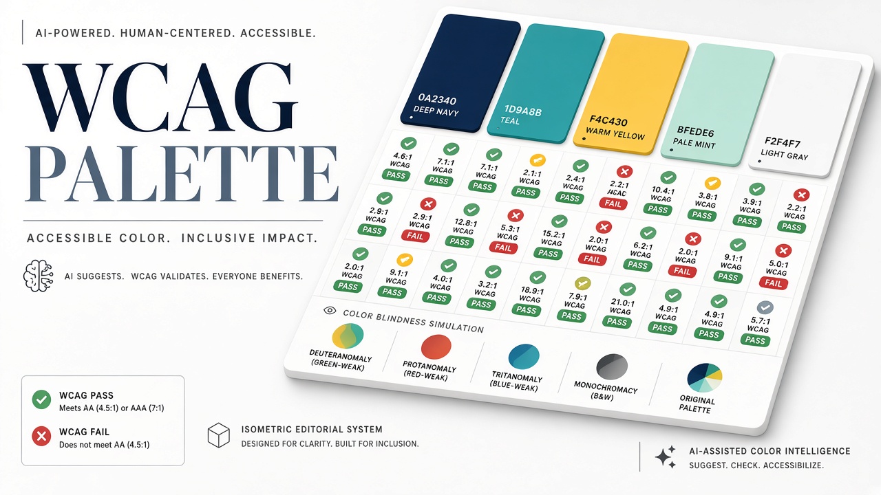
AI color palette tools generate harmonious gradients in seconds, yet pretty combinations often fail WCAG contrast minimums for text, icons, and focus rings. Designers using AI design assistants or mood boards from AI image generator outputs need a workflow that tests contrast, simulates color vision deficiencies, and locks accessible tokens into a design system before developers ship CSS variables to production.
What Is an Accessible Color Palette?
An accessible color palette defines foreground, background, border, and semantic colors where every production text and control state meets WCAG contrast minimums and remains distinguishable under common color vision deficiencies. Beauty and brand expression still matter; accessibility constrains the solution space rather than eliminating it. Designers often discover that disciplined palettes look more cohesive because fewer arbitrary hex values appear across screens.
Generation With Constraints
Start AI palette generation with explicit constraints: brand hue anchors, minimum contrast pairs for body text, and separate semantic colors for success, warning, and error states. Tools like Khroma, Coolors, and chat-based palette prompts excel at exploration but do not enforce WCAG 2.2 contrast ratios unless you add verification steps. Prompt for "accessible UI palette with 4.5:1 body text pairs on light and dark surfaces" and still validate numerically; models hallucinate compliance.
Extract colors from marketing imagery only as inspiration. Compression and gradient banding in AI-generated hero art produce hex values that look fine in isolation but fail on 1px hairline borders or 12px captions. Sample dominant colors, then adjust in OKLCH or HSL for predictable lightness steps.
| WCAG level | Normal text | Large text (18pt+ or 14pt bold) | UI components / graphics |
|---|---|---|---|
| AA (minimum) | 4.5:1 | 3:1 | 3:1 |
| AAA (enhanced) | 7:1 | 4.5:1 | Not defined for all graphics |
Light and Dark Theme Pairing
AI palettes generated for light mode often fail when inverted for dark mode because perceived contrast is non-linear. Build paired tokens (`text-primary-light`, `text-primary-dark`) tested independently. Do not auto-invert hex values without recomputing luminance. Dark mode accent colors frequently need higher chroma or lightness than their light-mode siblings to preserve 4.5:1 on charcoal backgrounds.
Contrast Checking Workflow
After AI suggests a palette, run every text-surface and interactive-state pair through a contrast checker using WCAG 2.2 relative luminance formulas. Figma plugins (Stark, A11y - Color Contrast Checker), Adobe Color in accessibility tools mode, and browser DevTools all compute ratios. Check hover, focus, disabled, and error states, not only default buttons. WCAG 1.4.11 Non-text Contrast requires 3:1 for user interface components and graphical objects; icon-only buttons and chart series count.
- Define semantic roles: primary text, secondary text, border, fill, accent.
- Map each role to light and dark theme surfaces.
- Test all pairwise combinations used in the design system.
- Fail the palette if any required pair misses AA; adjust lightness before hue.
- Export approved tokens as CSS variables or design tokens JSON.
Gradients behind text fail unless every stop along the gradient maintains contrast for the text overlay region. AI loves purple-to-pink hero gradients with white type; mid-gradient stops often drop below 4.5:1. Use scrim overlays or solid text panels when gradients are non-negotiable brand elements.
Color Blindness Simulation
Contrast ratio alone does not guarantee distinguishability; protanopia, deuteranopia, and tritanopia reduce separation between hues that look distinct to typical vision. Roughly 8 percent of men and 0.5 percent of women have some form of color vision deficiency. Simulate palettes with Stark, Color Oracle, or browser extensions, then verify that status colors (green success vs red error) differ by lightness and icon shape, not hue alone.
| Type | Affected cones | Design implication |
|---|---|---|
| Protanopia | L cones (red) | Red-green confusion; avoid red-only errors |
| Deuteranopia | M cones (green) | Most common; test charts and maps |
| Tritanopia | S cones (blue) | Blue-yellow confusion; rare but real |
Never rely on color alone for required information (WCAG 1.4.1 Use of Color). Pair hue with labels, patterns, or icons. AI-generated data visualizations especially need manual review because models optimize aesthetics over categorical separation.
Focus States and Interactive Colors
WCAG 2.4.11 Focus Appearance (Level AA in WCAG 2.2) requires visible focus indicators; AI palettes often omit focus ring colors until QA fails keyboard navigation tests. Define `focus-ring` tokens with 3:1 contrast against adjacent colors and sufficient area. Custom focus styles must not rely on color alone; combine outline width and offset. Test tab order through modals generated from AI wireframes, which frequently ship with invisible focus on ghost buttons.
Design System Integration
Promote vetted palette tokens into a design system with documented usage rules, not one-off hex picks per screen. Name tokens by role (`color-text-primary`, `color-border-focus`) rather than by hue (`blue-500`) so dark mode swaps stay accessible. Tools like Tokens Studio for Figma sync to GitHub for CI contrast regression tests. Some teams run automated axe or Pa11y checks in Storybook against components built from AI-suggested colors.
When AI design tools propose component variants, reject variants that introduce new unverified accent colors outside the token set. Centralize exception approval for marketing landing pages that need campaign-specific gradients, with the same contrast gate.
Automated Testing in CI
Shift-left accessibility by testing Storybook or component snapshots against contrast rules in continuous integration. Packages like jest-axe or pa11y-ci can fail builds when button variants introduced from AI mockups miss 4.5:1 text contrast. Store allowed token pairs in JSON; CI compares computed styles from rendered components rather than re-trusting designer screenshots. This catches regressions when engineers tweak alpha values for glassmorphism effects that look fine in Figma but fail in Chrome.
Handoff Checklist for Engineers
Designers export tokens with documented minimum contrast pairs, focus ring colors, and chart categorical palettes tested under deuteranopia simulation. Engineers implement semantic CSS variables, not raw hex scattered in components. QA validates high-contrast OS mode and forced-colors media query behavior where supported. AI-generated marketing pages that bypass the design system trigger the same checklist before launch.
AI Palette Tool Limitations
AI palette generators optimize for harmony and trend, not legal accessibility conformance or your product's state matrix. They rarely model focus rings against arbitrary photo backgrounds, chart color series beyond six categories, or print collateral. They cannot sign off on compliance; your checklist does. Re-run checks when brand refreshes or when OS-level forced colors and high-contrast modes interact with your CSS.
Working With Brand and Marketing
Marketing teams import AI campaign art faster than product design systems update; establish a fast-lane review for one-off landing pages. Extract hex values from hero images, run contrast checks on headline overlays, and reject campaigns that require white text on unpredictable photo regions without scrims. Teach marketers that accessible palettes are a subset of on-brand palettes, not a separate ugly mode. When AI image generator outputs drive seasonal campaigns, schedule accessibility review in the same sprint as legal review.
Common Failure Patterns
Teams repeatedly ship inaccessible UI when they treat AI palettes as final art direction without a token pass. Typical failures: light gray placeholder text on white (often near 2.5:1), blue link text on navy headers, success green indistinguishable from brand green in deuteranopia, and focus outlines removed for minimal aesthetics. Fix by elevating contrast before hue rotation in OKLCH space: adjust L channel until AA passes, then fine-tune chroma. Document "do not use" combinations in the design system README so future AI imports get corrected before merge.
Frequently Asked Questions
Is AAA required for all text?
No. WCAG AA (4.5:1 body text) is the common legal and procurement baseline. AAA (7:1) is desirable for long reading or vulnerable audiences but not universally mandated.
Do AI tools check contrast automatically?
Some integrated design assistants mention accessibility; few block export on failure. Always run an independent contrast checker on final token pairs.
What about dark-mode-only brands?
Dark backgrounds with light gray text often fail contrast while looking elegant. Test `#aaa` on `#111` explicitly; many fashionable grays land near 3:1, below AA for body copy.
Can we fix palettes after handoff to engineering?
Yes, but retrofits cost more than gating at design time. Token-based systems let you adjust lightness globally once QA finds failures.
Does WCAG cover gradients?
Contrast is measured for specific text against its immediate background. Gradients require checking the worst-case segment behind text or adding opaque overlays.
How often to re-audit?
On every major brand refresh, new AI-generated campaign art import, or design system version bump. Automated CI on core components catches regressions between audits.
Which simulation tools are enough?
Use at least protanopia and deuteranopia simulation on every semantic color pair; add tritanopia for data viz-heavy products. Simulation complements but does not replace contrast ratio math.
Can AI fix failing palettes automatically?
Some tools suggest nearest compliant color; verify suggestions in context because automated fixes may shift brand hue uncomfortably. Human designers should approve token updates before they propagate through AI design component libraries.
Is contrast enough for charts?
Charts need distinguishable series under color blindness simulation, not only text contrast. Add patterns, labels, or direct value annotations when AI-generated palettes produce similar hues across categories.