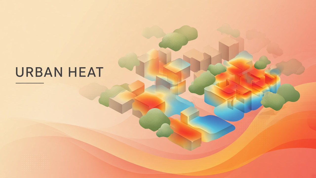
During a July heat wave, surface temperatures on an asphalt parking lot in Phoenix can exceed 70 degrees Celsius while a shaded bus stop three blocks away stays survivable for elderly riders waiting for transit. Citywide averages hide lethal microclimates. Traditional urban heat island studies relied on sparse weather stations and coarse land-cover maps that could not resolve ward-level risk or guide where to plant trees first. Urban heat island AI planning couples satellite thermal imagery, building footprints, vegetation indices, and socioeconomic vulnerability data into models that predict heat exposure at meter-scale resolution and optimize cooling interventions for equity.
Municipal heat action plans, public health departments, and resilience bond issuers increasingly require evidence-backed targeting. Teams prototyping resident-facing heat alerts through AI chatbot channels should trace whether exposure numbers come from station interpolations or validated downscaled models. More urban climate explainers live on the EliteAI.tools blog index.
What Urban Heat Island AI Planning Means in Plain Language
Urban heat island AI planning is the use of machine learning to map, forecast, and prioritize cooling interventions in cities by predicting thermal stress indices at fine spatial resolution and aligning them with population vulnerability. The urban heat island effect raises city temperatures above surrounding countryside through absorbed pavement, waste heat from buildings, reduced evapotranspiration, and canyon geometry that traps warmth. AI models learn relationships between land cover, morphology, and measured or simulated temperature fields, then extrapolate to blocks without sensors.
Planning outputs include where to add shade trees, which roofs to coat with cool materials, which cooling centers need expanded hours, and which neighborhoods merit first outreach before the next heat emergency. Universal Thermal Climate Index (UTCI) and wet-bulb globe temperature translate radiation and humidity into human comfort and heat-stress categories that public health agencies understand better than land surface temperature alone.
| Index | What it captures | Planning use |
|---|---|---|
| Land surface temperature (LST) | Satellite-measured surface radiance | Identify hot pavements and roofs |
| UTCI | Thermal comfort including radiation and wind | Pedestrian exposure, outdoor worker risk |
| Air temperature (2 m) | Near-ground air mass heat | Indoor cooling demand, health thresholds |
How Urban Heat AI Models Work
Urban heat AI pipelines ingest multispectral satellite tiles, LiDAR canopy height, building height and albedo, street trees, and weather reanalysis, then train gradient boosting, random forests, or graph neural networks to predict thermal indices at resolutions finer than native satellite pixels. Downscaling from 30 m or 100 m satellites to 1 m grids requires careful validation against mobile transects or distributed sensor networks.
GSM-UTCI and Philadelphia meter-scale mapping
GSM-UTCI applied to Philadelphia reported R-squared of 0.9151 and mean absolute error of 0.41 degrees Celsius for Universal Thermal Climate Index at 1 meter resolution, using geospatial machine learning on urban morphology and land cover predictors. Sub-degree MAE at 1 m scale means planners can distinguish hot sidewalks from adjacent tree shade on the same block. High R-squared indicates the model explains most variance in held-out UTCI fields, though performance may drop in cities with different building materials or monsoon humidity regimes.
CHAITRA and ward-level heat action in India
CHAITRA (Climate Health Assessment and Intervention Tool for Resilient Action) supports ward-level heat action planning across Indian cities by combining thermal exposure maps with health and demographic layers for municipal heat preparedness. Ward-level granularity matches administrative boundaries that Indian municipalities use to deploy cooling centers, water distribution, and outreach in local languages. The tool bridges satellite-derived heat surfaces with governance units that actually implement heat action plans.
CoolCity Phoenix and equity-weighted optimization
CoolCity, developed for Phoenix, optimizes cooling interventions under budget constraints while weighting thermal exposure against social vulnerability, reporting correlation r = 0.40 between temperature burden and vulnerability indices in equity-focused scenarios. Moderate correlation shows that hottest pixels do not always overlap poorest neighborhoods; optimization must explicitly encode equity weights rather than assuming heat alone identifies priority zones. CoolCity demonstrates how AI planning moves from prediction to decision support: where should limited tree planting dollars go to reduce heat deaths, not just average temperature?
| Model / program | Key metrics | Planning output |
|---|---|---|
| GSM-UTCI (Philadelphia) | R² 0.9151; MAE 0.41 °C; 1 m resolution | Pedestrian-scale UTCI maps |
| CHAITRA (India) | Ward-level heat-health integration | Municipal heat action targeting |
| CoolCity (Phoenix) | r = 0.40 temp-vulnerability correlation | Equity-weighted cooling portfolio |
Typical planning workflow
- Acquire summer LST or conduct mobile temperature transects for ground truth.
- Stack predictors: NDVI, building height, impervious fraction, albedo, distance to parks.
- Train downscaling model; validate with held-out sensors (report R² and MAE).
- Overlay CDC or local social vulnerability index; do not assume heat equals risk.
- Run optimization (CoolCity-style) for tree planting, cool roofs, or shade structures.
- Publish maps with ward or census tract boundaries for public heat action plans.
- Re-run after major land-use changes or every three to five years as climate warms.
Data Sources and Model Inputs
High-resolution urban heat models stack LiDAR-derived canopy height, building footprint databases, land cover from NAIP or municipal GIS, albedo from multispectral imagery, and impervious surface maps from classification models. Missing inputs force downscaling models to interpolate from coarser predictors, which widens uncertainty bands. Philadelphia GSM-UTCI work benefited from rich urban GIS; smaller cities may need to invest in open data portals before chasing 1 m UTCI claims.
Mobile transects with bicycle-mounted sensors or volunteer networks (CAPA strategies, ISeeChange) supply ground truth for calibration. Models trained only on satellite LST without transect validation often show pretty maps that misrank block-level risk. Publish validation protocol alongside R²: number of sensors, dates, weather conditions, and hold-out neighborhoods.
Real Deployments and Published Evidence
Cities from Philadelphia to Ahmedabad now embed AI-derived heat maps in extreme heat preparedness plans, cooling center siting, and green infrastructure bond applications. GSM-UTCI-level accuracy makes block-scale arguments credible to city councils debating tree budgets. CHAITRA aligns with India's National Disaster Management Authority heat guidelines at scales municipalities actually manage.
Phoenix CoolCity results caution that equity requires explicit objectives: r = 0.40 between temperature and vulnerability means planners must merge datasets deliberately. Heat action without vulnerability weighting may cool wealthy districts with more canopy already while missing rental deserts with aging housing stock and limited AC access.
Limits, Risks, and Equity Guardrails
Urban heat AI models trained in one climate zone transfer poorly without revalidation; downscaled maps can imply precision that mobile sensors disprove; optimization without community input risks planting trees that displace residents or ignore indoor heat trapped in poorly insulated housing.
- Indoor vs outdoor: UTCI maps outdoor exposure; indoor deaths dominate in some heat events.
- Temporal mismatch: Satellite LST is snapshot; afternoon peak may differ from 11 a.m. overpass.
- Green gentrification: Cooling investments can raise rents; pair with housing policy.
- Model opacity: Councils need plain-language uncertainty bands, not single hot pixels.
Who Should Use This and Who Should Wait
Municipal resilience offices, regional public health agencies, and utilities planning demand response should adopt GSM-UTCI-class downscaling where summer heat mortality is documented, validating MAE against local sensors. Small towns without GIS staff should partner with state universities or use coarser NOAA tools until capacity exists.
| Audience | Recommendation | Caveat |
|---|---|---|
| Large US city resilience office | Deploy GSM-UTCI-style 1 m maps | Validate MAE locally |
| Indian municipal corporation | Adopt CHAITRA ward workflows | Integrate local health records |
| Desert sunbelt planner | Use CoolCity equity optimization | Heat ≠ vulnerability; weight both |
| Rural county | Wait or use regional coarse products | 1 m models need urban morphology data |
Frequently Asked Questions
How accurate is GSM-UTCI for city planning?
In Philadelphia validation, GSM-UTCI achieved R² of 0.9151 and MAE of 0.41 °C at 1 m resolution, supporting block-scale pedestrian heat mapping when locally validated. Transfer to humid or mountainous cities requires new ground truth.
Should planners use UTCI or land surface temperature?
UTCI incorporates radiation, wind, and humidity for human thermal stress; LST measures surface radiance useful for cool roof targeting but less direct for physiological heat risk. Public health communication benefits from UTCI categories.
What does CHAITRA provide for Indian cities?
CHAITRA links ward-level thermal exposure to heat action planning tools aligned with municipal administrative boundaries and health preparedness workflows. Ward scale matches how cities deploy cooling centers and outreach.
Why does CoolCity report r = 0.40 for heat and vulnerability?
Moderate correlation shows hottest blocks are not always the most vulnerable neighborhoods; equity optimization must weight social factors explicitly, not assume temperature alone identifies priority zones. CoolCity encodes those weights in optimization.
Can AI tell cities exactly where to plant trees?
Optimization models like CoolCity recommend portfolios of shade trees, cool roofs, and outreach under budget constraints, but final siting needs community input, utility clearance, and maintenance budgets. AI narrows options; politics and equity finalize choices.
Do heat models include future warming?
Many planning maps describe present or recent summers; climate-adjusted scenarios require adding CMIP downscaled temperature increments to baseline UTCI or air temperature fields. Ask vendors whether outputs are static or climate-projected.
How should cities communicate heat maps to residents?
Translate UTCI or heat index categories into plain-language action guidance (hydration, cooling center hours, check on elderly neighbors) rather than publishing raw raster values. Maps tied to recognizable landmarks and transit stops improve uptake more than abstract color gradients alone.
Conclusion
Urban heat island AI planning turns coarse satellite heat into meter-scale UTCI maps, ward-level action tools, and equity-aware cooling portfolios. GSM-UTCI delivers R² 0.9151 and 0.41 °C MAE in Philadelphia; CHAITRA operationalizes heat action across Indian wards; CoolCity shows that temperature and vulnerability correlate modestly (r = 0.40), demanding explicit equity weights. Credible heat plans validate models locally, pair outdoor maps with indoor risk programs, and involve communities before planting decisions. AI identifies where heat concentrates; policy decides who gets relief first. Annual map updates before heat season let outreach teams pre-position cooling supplies in wards CHAITRA or CoolCity flag as high joint temperature-vulnerability risk.