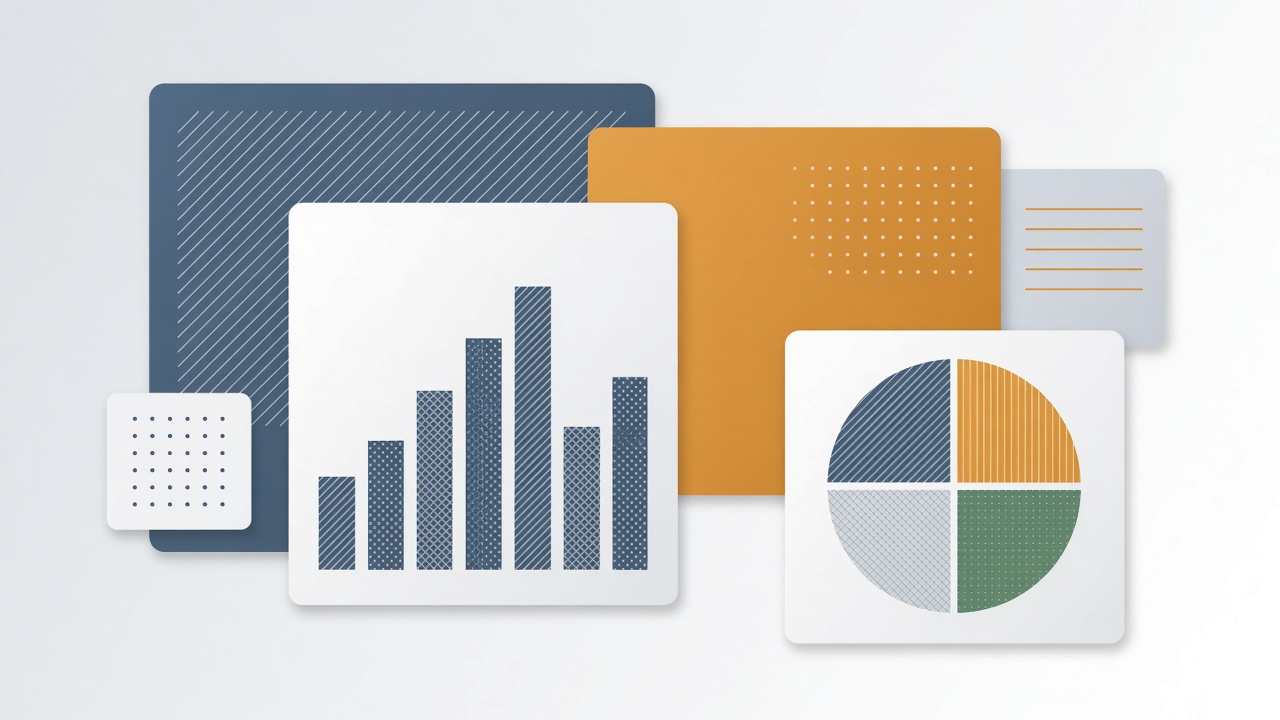
A quarterly revenue dashboard uses red and green bars to show losses and gains. To roughly 8 percent of men with color vision deficiency (CVD), those bars look nearly identical. Color blind friendly data visualization AI tools promise to fix the problem automatically: algorithms suggest palettes that separate hues for deuteranopia, protanopia, and tritanopia, optimize WCAG contrast ratios, and add patterns or direct labels when color alone cannot carry meaning. The three main types affecting red-green and blue-yellow perception are deuteranopia protanopia and tritanopia. Data teams want compliance without manually recoloring every Tableau, Power BI, or D3 chart.
Analysts and design systems leads should know which CVD types matter for their audience, when classical tools like ColorBrewer suffice, and where machine learning adds genuine value versus marketing gloss. Teams also using AI chatbot interfaces for data queries should ensure generated charts inherit the same accessibility rules. Browse the EliteAI.tools blog index for related explainers.
What Color Blind Friendly Data Visualization AI Means in Plain Language
Color blind friendly data visualization AI refers to software that analyzes charts and dashboards to recommend or apply color palettes, textures, and labeling strategies so people with color vision deficiency can distinguish data series accurately. The approach extends beyond picking "better blues and oranges": it includes simulating how a chart appears under different CVD models, scoring discriminability between adjacent colors, and inserting non-color encodings like hatch fills or numeric callouts.
Color vision deficiency is not binary blindness. Deuteranomaly (reduced green sensitivity) and deuteranopia are most common; protanomaly and protanopia affect red perception; tritanomaly and tritanopia are rarer and impact blue-yellow discrimination. Monochromacy is uncommon. AI palette optimizers typically target the red-green forms that affect the largest share of viewers.
| CVD type | Affected cone cells | Common confusion |
|---|---|---|
| Deuteranopia / deuteranomaly | M (green) cones | Red versus green, brown versus olive |
| Protanopia / protanomaly | L (red) cones | Red versus green, dim reds look dark |
| Tritanopia / tritanomaly | S (blue) cones | Blue versus yellow, purple versus red |
WCAG contrast and non-color cues
WCAG 2.1 Success Criterion 1.4.1 Use of Color requires that color is not the only visual means of conveying information, and SC 1.4.3 Contrast (Minimum) sets 4.5:1 text contrast for normal text. AI tools should enforce both: a palette distinguishable under CVD simulation still fails if legend text is light gray on white. Pattern fills, shape markers, and direct series labels satisfy the non-color requirement more reliably than hue tweaks alone.
How the Underlying AI Pipeline Works
AI palette pipelines parse chart metadata (series count, data types, brand colors), simulate CVD transformations using Brettel-Vienot or Machado models, optimize color assignments under perceptual distance metrics, and optionally generate alt text or redesign marks. Some products integrate into Figma, Observable, or Jupyter; others run as linting services on exported SVG.
ColorBrewer and classical baselines
ColorBrewer, developed by Cynthia Brewer and Mark Harrower, remains the gold-standard curated palette for cartography and scientific visualization. Sequential, diverging, and qualitative schemes were hand-tested for print and screen. AI optimizers often start from ColorBrewer seeds or Paul Tol's bright/muted qualitative palettes, then adjust hex values to meet brand guidelines while preserving minimum ΔE (CIE color difference) under simulated deuteranopia. When brand colors are sacred, AI may sacrifice secondary series colors before touching the primary corporate hue.
AI palette optimization methods
Optimization formulations treat each data series as a node in a graph where edge weights penalize low perceptual distance under CVD transforms. Genetic algorithms, mixed-integer solvers, and gradient-based methods search hex or OKLCH coordinates. Deep learning approaches train on human discrimination judgments from psychophysics studies to predict confusability faster than physics-based simulation alone. Microsoft's ColorCraft research and Tableau's accessibility checks exemplify product-integrated scoring; open tools like colorspace R package and chroma.js offer programmatic control without ML.
Pattern and texture alternatives
When more than eight categorical series collide, hue alone fails even for typical vision. AI layout engines can propose stripe, dot, and crosshatch fills from texture libraries, ensuring patterns remain distinguishable at small legend swatch size. For line charts, dash patterns and marker shapes rotate automatically. Generative models experiment with SVG pattern synthesis, but most production systems use deterministic libraries vetted by accessibility designers.
| Technique | Strength | Limitation |
|---|---|---|
| CVD simulation (Machado et al.) | Predicts viewer experience per CVD type | Individual variation not captured |
| OKLCH perceptual space optimization | Smooth interpolation, wide gamut | Display gamut clipping on sRGB |
| Direct labeling (no legend) | Removes color-memory burden | Crowded on dense charts |
| Pattern fills | Works when hue exhausted | Print and small-screen clutter |
| LLM chart alt text | Screen reader summary of trends | May hallucinate values if OCR wrong |
OKLCH and modern color spaces in AI optimizers
sRGB hex optimization fights perceptual uniformity: two colors equally spaced in hex may look nearly identical to deuteranopes. OKLCH (lightness, chroma, hue in a perceptual space) lets optimizers step evenly along hue wheels while holding lightness constant for contrast compliance. CSS Color Module Level 4 supports OKLCH in modern browsers; charting libraries lag but preprocessors can convert optimized OKLCH back to hex for D3 and Chart.js. AI palette services that output design tokens in OKLCH simplify dark-mode regeneration because lightness channels invert predictably without recomputing entire palettes from scratch.
Typical workflow steps
- Export chart spec or connect BI tool API with series names and hex colors.
- Run CVD simulation for deuteranopia, protanopia, and tritanopia; flag confusable pairs.
- Optimize palette or apply ColorBrewer qualitative scheme with brand constraints.
- Add patterns, markers, or direct labels for any remaining collisions.
- Verify WCAG text contrast on titles, axes, and annotations.
- Validate with color-blind reviewers or discrimination apps (Sim Daltonism, Color Oracle).
Real Deployments and Published Evidence
Major BI platforms embed accessibility checks: Power BI reports accessibility issues in its checker; Tableau highlights insufficient contrast; Google Sheets added CVD-friendly themes. Adobe Color and Figma plugins simulate CVD and suggest alternatives. Research from IEEE VIS and CHI shows AI-optimized palettes reduce discrimination errors in controlled lab studies compared to default Excel schemes, though gains shrink when designers already use ColorBrewer.
Financial regulators and public health agencies increasingly publish data visualization style guides mandating Tol palettes and direct labeling. The U.K. Government Analysis Function recommends avoiding red-green diverging scales for critical communications. AI linting services scan government dashboard repositories nightly, opening pull requests with recolored SVG when confusability scores drop below threshold.
Scientific publishing faces pressure from journals requiring accessible figures. Cell Press and Nature portfolio guidelines encourage pattern keys in multi-panel fluorescence images where green and red channels mimic the worst CVD confusions. AI tools that separate channels into labeled grayscale insets assist authors but still need domain expert review so biological meaning is preserved.
Dashboard design patterns beyond color
Small multiples (one chart per series) eliminate color discrimination problems at the cost of screen space. Sparklines with inline numeric labels let executives scan KPIs without matching legend colors. AI layout assistants can propose when to switch from a stacked bar chart to faceted rows based on series count and detected CVD risk in the current palette. Heatmaps remain problematic: rainbow spectral palettes are unreadable for most CVD types and mislead typical vision viewers through perceptual nonlinearity. Viridis and cividis perceptually uniform scales, promoted in matplotlib and R ggplot2, should replace jet rainbows before any CVD optimizer runs.
Motion and animation introduce accessibility issues AI color tools ignore. A pulsing red alert that turns orange on hover still fails non-color requirements if shape does not change. Data storytelling videos should narrate trend direction rather than relying on color alone in animated transitions. WCAG 2.3.1 Three Flashes constrains flashing red success indicators common in trading dashboards.
Geographic information systems and election maps historically abused red-blue choropleths that fail both CVD and political-neutral design goals. AI recoloring tools can propose purple-orange or blue-amber diverging schemes with hatch overlays for swing counties, but cartographers must still validate that cultural associations of new hues do not confuse international audiences. Interactive tooltips that show exact vote counts reduce reliance on color bins entirely.
Design system teams should document accessible palette tokens alongside typography and spacing so engineers do not improvise hex values at implementation time. Storybook or Figma variables that export to JSON give AI linters a single source of truth to validate pull requests against before merge.
Limits, Risks, and Ethical Guardrails
AI palette tools cannot fix bad chart types: pie charts with twelve slices remain unreadable even with perfect colors. Simulations model average CVD physiology; individual viewers vary. Dark mode dashboards invert contrast assumptions an optimizer made for white backgrounds. Relying on color alone for stock "up/down" semantics reinforces cultural red-green money tropes that still confuse many CVD users.
- Over-automation: Blind application of AI palettes may clash with brand identity or cultural color meanings.
- False compliance: Passing a simulator does not guarantee real-user comprehension; task testing matters.
- Print mismatch: Office printers desaturate colors; patterns save print accessibility.
- Data ink: Excessive patterns reduce chart readability for everyone.
- Alt text errors: LLM-generated chart summaries can misstate trends if axis scales are logarithmic.
Ethical guardrails include involving color-blind employees in design critiques, publishing palette tokens in accessible design systems, and pairing automated checks with plain-language data tables for critical decisions (medical dosing, election results). WCAG conformance statements should mention non-color encodings, not palette scores alone.
Who Should Use This and Who Should Wait
Enterprise analytics teams, public-sector open data portals, and SaaS products with embedded charts should integrate CVD simulation and palette linting into CI pipelines now. Individual bloggers making one chart per month can use ColorBrewer manually without AI. Teams awaiting a magic "fix all charts" button should instead adopt design system tokens first.
| Team profile | Recommendation | First step |
|---|---|---|
| Fortune 500 BI program | Automated linting plus token library | Audit top 50 dashboards for red-green pairs |
| Startup product charts | Embed OKLCH-safe theme in charting library | Adopt Paul Tol qualitative set |
| Scientific author | Pattern keys plus grayscale insets | Check journal figure guidelines |
| Casual presenter | Manual ColorBrewer is enough | Label bars directly in slides |
Frequently Asked Questions
Are blue and orange always safe for color-blind users?
Blue-orange pairs work well for many deuteranopia and protanopia viewers but can confuse tritanopia; always add labels or shapes for critical data. No two-color pair is universal; test against all three major CVD types.
When is ColorBrewer enough without AI?
For categorical charts with six or fewer series and no strict brand hex constraints, hand-picked ColorBrewer or Paul Tol palettes match AI output quality. AI helps when brand colors are fixed, series count is high, or charts are generated dynamically at scale.
Does WCAG require specific chart colors?
WCAG requires non-color cues and sufficient contrast for text; it does not mandate particular hues. Simulators and AI optimizers help meet intent but are not themselves certification.
Do color-blind palettes work in dark mode?
Dark backgrounds change perceived lightness; palettes optimized for white backgrounds may collapse in dark mode unless re-optimized. Maintain separate token sets or run optimizers per theme.
Can AI write chart alt text?
Vision-language models can summarize trends from chart images but risk numeric errors; pairing structured data feeds with templates is safer. Human review remains important for regulatory filings.
How do teams test with color-blind users?
Recruit participants with diagnosed CVD for task-based discrimination tests (match series to values) rather than relying only on simulation software. Simulators approximate average physiology, not individual experience.
What palettes work for heatmaps?
Perceptually uniform sequential scales like viridis, cividis, and batlow avoid the red-green confusion of rainbow jet maps and remain readable for many CVD types. AI optimizers should ban jet and spectral defaults before tuning brand colors on heatmap products.
Conclusion
Color blind friendly data visualization AI combines CVD simulation, perceptual palette optimization, and non-color encodings like patterns and direct labels to make dashboards legible for deuteranopia, protanopia, and tritanopia viewers. ColorBrewer and Paul Tol palettes remain strong manual baselines; machine learning shines at scale with brand constraints and automated linting. WCAG demands more than hue swaps: contrast, labeling, and chart type choice matter equally. Teams should embed accessibility tokens in design systems, test with color-blind reviewers, and treat AI optimizers as assistants that enforce rules designers already understand, not substitutes for thoughtful data presentation.