MCP Design System Extractor
Extract component metadata from Storybook design systems for AI model context.
Key Features
Use Cases
README
MCP Design System Extractor
A Model Context Protocol (MCP) server that extracts component information from Storybook design systems. Connects to Storybook instances (including https://storybook.js.org distributions) and extracts HTML, styles, and component metadata.
Key Dependencies
- Puppeteer: Uses headless Chrome for dynamic JavaScript component rendering
- Chrome/Chromium: Required for Puppeteer (automatically handled in Docker)
- Works with built Storybook distributions from https://storybook.js.org
Features
- 🔍 List Components: Get all available components from your Storybook
- 📄 Extract HTML: Get the rendered HTML of any component variant with dynamic JavaScript support
- 🔎 Search Components: Find components by name, title, or category
- 🎛️ Component Props: Get component props/API documentation including types and defaults
- 🔗 Component Dependencies: Analyze which components are used within other components
- 📐 Layout Components: Get all layout components (Grid, Container, Stack, etc.) with examples
- 🎨 Theme Information: Extract design system theme (colors, spacing, typography, breakpoints)
- 🎯 Search by Purpose: Find components by their purpose (form inputs, navigation, feedback)
- 🧩 Composition Examples: Get examples of how components are combined together
- 📝 External CSS Analysis: Fetch and analyze CSS files to extract design tokens and variables
Quick Start
npm install && npm run build
npm run setup  # Interactive setup for Claude Desktop
Or set manually:
export STORYBOOK_URL=http://localhost:6006
Usage
See DEVELOPMENT.md for detailed setup instructions.
Available Tools
Core Tools
-
list_components
- Lists all available components from the Storybook instance
- Returns components with their names, categories, and associated stories
- Use
category: "all"or omit category parameter to list all components - Filter by specific category path (e.g., "Components/Buttons", "Layout")
- Supports pagination with
pageandpageSizeparameters (default: 50 per page)
-
get_component_html
- Extracts HTML from a specific component story in Storybook
- Requires story ID format: "component-name--story-name" (e.g., "button--primary")
- Use list_components or get_component_variants first to find valid story IDs
- Optional CSS style extraction for understanding component styling
- Supports dynamic JavaScript-rendered content
-
get_component_variants
- Gets all story variants/states for a specific component
- Returns all stories (variants) for a component with their IDs, names, and parameters
- Component name must match exactly as shown in list_components (case-sensitive)
-
search_components
- Search components by name, title, or category using case-insensitive partial matching
- Name is component name only (e.g., "Button")
- Title is full story path (e.g., "Components/Forms/Button")
- Category is the grouping (e.g., "Components/Forms")
- Use
query: "*"to list all components - Search in specific fields: "name", "title", "category", or "all" (default)
- Supports pagination with
pageandpageSizeparameters (default: 50 per page)
Component Analysis Tools
-
get_component_props
- Extracts component props/API documentation from Storybook's argTypes configuration
- Includes prop names, types, default values, required status, and control options
- Requires story ID format: "component-name--story-name"
-
get_component_dependencies
- Analyzes rendered HTML to find which other components a given component internally uses
- Detects React components, web components, and CSS class patterns
- Helps understand component relationships and composition
- Requires story ID format: "component-name--story-name"
Design System Tools
-
get_layout_components
- Gets all layout components (Grid, Container, Stack, Box) with usage examples
- Optional HTML examples for each layout component
- Useful for understanding page structure and composition patterns
-
get_theme_info
- Gets design system theme information (colors, spacing, typography, breakpoints)
- Extracts CSS custom properties/variables from the design system
- Categorizes tokens by type for better organization
- Optional parameter to include all CSS custom properties found
Discovery Tools
-
get_component_by_purpose
- Search for components by their purpose or function
- Available purposes: "form inputs" (input fields, selects, checkboxes), "navigation" (menus, breadcrumbs, tabs), "feedback" (alerts, toasts, modals), "data display" (tables, cards, lists), "layout" (grids, containers, dividers), "buttons" (all button types), "progress" (loaders, spinners), "media" (images, videos, carousels)
- Flexible pattern matching for finding components by use case
- Supports pagination with
pageandpageSizeparameters (default: 50 per page)
-
get_component_composition_examples
- Gets examples of how components are combined together in real-world patterns and layouts
- Returns HTML examples showing the component used with other components in forms, cards, layouts, or complex UI patterns
- Helps understand how components work together in practice
- Optional limit parameter to control number of examples returned
-
get_external_css ⚠️ TOKEN-OPTIMIZED
- DEFAULT: Returns ONLY design tokens + file stats (avoids token limits)
- Does NOT return CSS content by default (prevents 25K token limit errors)
- Extracts & categorizes tokens: colors, spacing, typography, shadows, breakpoints
- Use
includeFullCSS: trueonly when you specifically need CSS content - Security-protected: only accepts URLs from the same domain as your Storybook
- Perfect for design token extraction without hitting response size limits
Example Usage
// List all components (recommended first step)
await listComponents({ category: "all" });

// Search for all components using wildcard
await searchComponents({ query: "*", searchIn: "all" });

// Search for specific components
await searchComponents({ query: "button", searchIn: "name" });

// Get all variants of a specific component
await getComponentVariants({ componentName: "Button" });

// Get HTML for a specific button variant (use exact story ID from above)
await getComponentHTML({
  componentId: "button--primary",
  includeStyles: true
});

// Get component props documentation
await getComponentProps({
  componentId: "button--primary"
});

// Find components by purpose
await getComponentByPurpose({
  purpose: "form inputs"
});

// Get layout components with examples
await getLayoutComponents({
  includeExamples: true
});

// Extract theme information
await getThemeInfo({
  includeAll: false
});

// Analyze component dependencies
await getComponentDependencies({
  componentId: "card--default"
});

// Get composition examples
await getComponentCompositionExamples({
  componentId: "button--primary",
  limit: 3
});

// RECOMMENDED: Extract design tokens only (small response, avoids token limits)
await getExternalCSS({
  cssUrl: "https://my-storybook.com/assets/main.css"
  // extractTokens: true (default), includeFullCSS: false (default)
});

// ONLY when you specifically need CSS content (may hit token limits)
await getExternalCSS({
  cssUrl: "./assets/tokens.css",
  includeFullCSS: true,
  maxContentSize: 10000
});

// Search with pagination
await searchComponents({
  query: "button",
  page: 1,
  pageSize: 10
});
AI Assistant Usage Tips
When using with Claude or other AI assistants:
- Start with discovery: Use
list_componentswithcategory: "all"orsearch_componentswithquery: "*"to see all available components - Get story IDs: Use
get_component_variantsto find exact story IDs needed for other tools - Use exact IDs: Story IDs must be in format "component-name--story-name" (e.g., "button--primary")
- Explore by purpose: Use
get_component_by_purposeto find components by their function - Debug issues: Tools now include debug information when no results are found
How It Works
Connects to Storybook via /index.json and /iframe.html endpoints. Uses Puppeteer with headless Chrome for dynamic JavaScript rendering. Extracts component HTML, styles, props, dependencies, and design tokens with smart caching and timeout protection.
Troubleshooting
- Ensure Storybook is running and
STORYBOOK_URLis correct - Use exact story ID format: "component-name--story-name"
- Try
list_componentsfirst to see available components - Check
/index.jsonendpoint directly in browser - See DEVELOPMENT.md for detailed troubleshooting
Requirements
- Node.js 18+
- Chrome/Chromium (for Puppeteer)
- Running Storybook instance
Development
See DEVELOPMENT.md for detailed development instructions.
License
MIT
Star History
Repository Owner

User
Repository Details
Programming Languages
Tags
Join Our Newsletter
Stay updated with the latest AI tools, news, and offers by subscribing to our weekly newsletter.
Related MCPs
Discover similar Model Context Protocol servers
Fetcher MCP
Intelligent web content fetching and extraction using Playwright.
Fetcher MCP is a server that fetches and extracts web page content using the Playwright headless browser while supporting the Model Context Protocol. It intelligently processes dynamic web pages with JavaScript, employs the Readability algorithm to extract main content, and supports output in both HTML and Markdown formats. Designed for seamless integration with AI model environments, it offers robust parallel processing, resource optimization, and flexible deployment options including Docker.
- ⭐ 906
- MCP
- jae-jae/fetcher-mcp
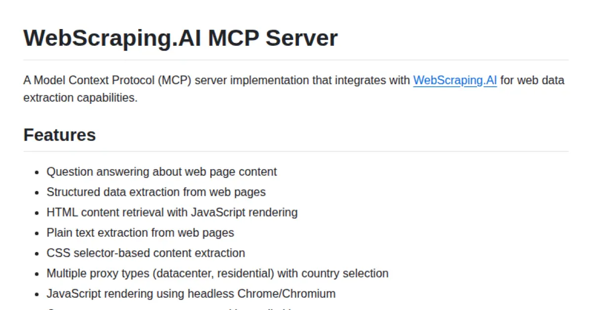
WebScraping.AI MCP Server
MCP server for advanced web scraping and AI-driven data extraction
WebScraping.AI MCP Server implements the Model Context Protocol to provide web data extraction and question answering functionalities. It integrates with WebScraping.AI to offer robust tools for retrieving, rendering, and parsing web content, including structured data and natural language answers from web pages. It supports JavaScript rendering, proxy management, device emulation, and custom extraction configurations, making it suitable for both individual and team deployments in AI-assisted workflows.
- ⭐ 33
- MCP
- webscraping-ai/webscraping-ai-mcp-server
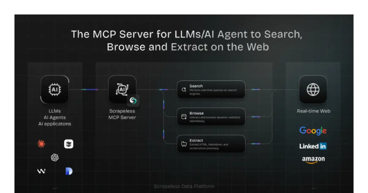
Scrapeless MCP Server
A real-time web integration layer for LLMs and AI agents built on the open MCP standard.
Scrapeless MCP Server is a powerful integration layer enabling large language models, AI agents, and applications to interact with the web in real time. Built on the open Model Context Protocol, it facilitates seamless connections between models like ChatGPT, Claude, and tools such as Cursor to external web capabilities, including Google services, browser automation, and advanced data extraction. The system supports multiple transport modes and is designed to provide dynamic, real-world context to AI workflows. Robust scraping, dynamic content handling, and flexible export formats are core parts of the feature set.
- ⭐ 57
- MCP
- scrapeless-ai/scrapeless-mcp-server

Shadcn UI v4 MCP Server
Seamlessly integrate shadcn/ui components into AI-assisted development workflows.
Shadcn UI v4 MCP Server acts as a Model Context Protocol server, delivering comprehensive access to shadcn/ui v4 components, blocks, examples, and metadata for AI assistants. It supports multiple frameworks including React, Svelte, Vue, and React Native, and enables retrieval of component source code and demos for programmatic use. Features include metadata access, directory browsing, smart GitHub API caching, and Server-Sent Events for scalable multi-client support. Production-ready options such as Docker containerization and flexible transport modes simplify deployment and integration.
- ⭐ 2,451
- MCP
- Jpisnice/shadcn-ui-mcp-server
dbt MCP Server
Bridge dbt projects and AI agents with rich project context.
dbt MCP Server provides an implementation of the Model Context Protocol for dbt projects, enabling seamless integration between dbt and AI agents. It allows agents to access and understand the context of dbt Core, dbt Fusion, and dbt Platform projects. The tool supports connection to external AI products and offers resources for building custom agents. Documentation and examples are provided to facilitate adoption and integration.
- ⭐ 420
- MCP
- dbt-labs/dbt-mcp
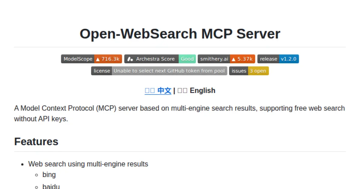
Open-WebSearch MCP Server
Multi-engine web search MCP server without API keys
Open-WebSearch MCP Server is a Model Context Protocol (MCP) compliant server offering web search functionalities using multiple search engines without the need for API keys or authentication. It provides structured search results with titles, URLs, and descriptions, and enables fetching of article content from supported sources such as CSDN and GitHub. The server supports extensive configuration through environment variables, including proxy settings and search engine customization. Designed for flexibility, it operates in both HTTP and stdio modes, making it suitable for integration into larger systems.
- ⭐ 463
- MCP
- Aas-ee/open-webSearch
Didn't find tool you were looking for?