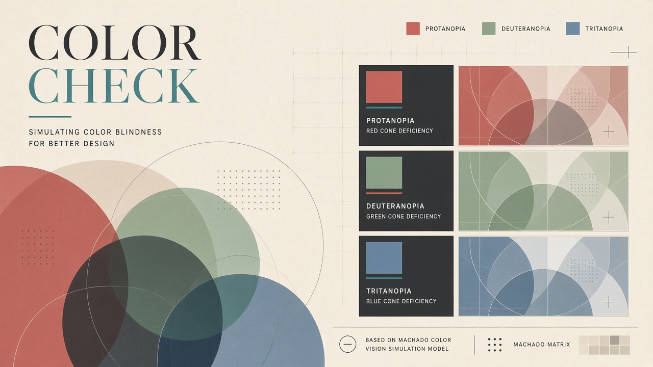
Roughly one in twelve men and one in two hundred women have some form of color vision deficiency. Design teams that rely on red-green status indicators alone ship interfaces millions cannot parse. ai color blind design simulation tools apply physiologically grounded transforms to mockups and production CSS so designers preview protanopia, deuteranopia, and tritanopia before release. Figma plugins such as DeficiencyView and Color Blind Check implement Machado 2009 matrices widely cited in accessibility literature. Simulation previews confusion; it does not replicate lived experience or compensate for individual variation. WCAG 2.2 Level AA still requires 4.5:1 contrast for normal text and meaningful non-color cues for state. Teams browsing AI image generator workflows or popular AI tools for design ops should pair simulation with contrast audits, patterns, labels, and testing with color-blind participants.
Types of Color Vision Deficiency
Protanopia and protanomaly reduce sensitivity to red light; deuteranopia and deuteranomaly affect green perception; tritanopia and tritanomaly affect blue-yellow discrimination and are rarer. Red-green confusion dominates UI failures: success green versus error red, chart series differentiated only by hue, form validation outlined in color alone. Blue-yellow issues surface in dark mode gradients and map overlays. Achromatopsia (complete color blindness) is uncommon; most users with CVD perceive some color but confuse specific pairs. Designers should test all three major simulation modes, not only deuteranopia presets.
Age and ambient light change perception; simulations assume standard conditions. Medical diagnoses vary in severity. Disclaimer copy on simulation tools should state that digital filters approximate cone response models, not individual eyes. Never tell stakeholders that passing simulation guarantees accessibility.
Simulation Algorithms in Design Tools
Machado, Costa, and Oliveira (2009) published linear matrix transforms mapping RGB values to approximate dichromatic vision; most Figma and browser extensions use these coefficients. DeficiencyView and Color Blind Check let designers toggle protanopia, deuteranopia, and tritanopia on artboards. Browser DevTools extensions apply CSS filters on live sites for staging review. AI-assisted plugins emerging in 2025 suggest alternative palettes that preserve brand hues while increasing separability, but human designers should approve shifts that affect marketing guidelines.
| Deficiency type | Common UI failure | Non-color fix |
|---|---|---|
| Deuteranopia | Green/red chart lines merge | Dash patterns, direct labels |
| Protanopia | Error states invisible on red buttons | Icons plus text labels |
| Tritanopia | Blue/purple gradients flatten | Luminance contrast, borders |
| All types | Status dots without legends | Text status, shape coding |
Integrating Checks Into CI and Figma
Design systems export tokens to CI jobs that run contrast checks and simulated palette diffs on every pull request, blocking merges when critical pairs fall below WCAG 2.2 AA 4.5:1 for body text. Figma libraries attach simulation components showing each semantic color under three deficiencies. Storybook addons render React components in simulated modes for engineers who never open Figma. AI palette suggesters propose token adjustments but should log before/after contrast ratios for audit. Keep simulation screenshots as visual regression baselines when rebranding.
Production CSS should not rely on filter hacks for end users; simulations are author-time only. Real users need accessible palettes baked into themes. Dark mode doubles combinations to test; a pair that passes in light mode may fail when desaturated on charcoal backgrounds.
Beyond Color: Patterns and Labels
WCAG Success Criterion 1.4.1 requires that information conveyed by color also be available through text, icons, patterns, or shapes. Line charts should vary stroke dash and markers, not only hue. Required form fields need asterisks and "required" text, not red outlines alone. Maps can use hatching for regions. Simulation tools reveal when two brand colors collapse; designers then add secondary encodings rather than chasing impossible rainbow separation within strict brand books.
Motion and micro-interactions can reinforce state changes for users who miss color shifts. Ensure animations respect prefers-reduced-motion. Tooltips that name series colors help when charts stay monochrome-friendly.
User Testing With Color-Blind Participants
Recruit color-blind users for task-based usability studies on beta builds; simulation cannot catch cognitive habits, lighting glare, or compensatory strategies real people use. Compensate participants fairly and screen for type of CVD. Sessions uncover issues matrices miss, such as confusing iconography or tiny legend text. Combine qualitative findings with automated contrast reports in design review tickets. One round before major launch prevents costly retrofit when support tickets spike after release.
Employee resource groups may include volunteers with CVD willing to join dogfood programs. Protect privacy; do not label individuals as "the color-blind tester" in public roadmaps. Aggregate feedback into actionable token changes.
Government service portals that use red error banners and green success toasts without icons draw frequent complaints from veterans and tax filers with deuteranomaly. Simulation during design sprints catches those patterns before millions of citizens hit submit on deadline day. Healthcare dashboards that color-code vital signs must pair hues with numeric thresholds and directional arrows so clinicians scanning multiple patients do not misread a borderline reading because red and orange collapse under protanopia.
Design tokens exported to Android and iOS native apps need the same Machado preview screenshots attached to pull requests as web Storybook builds. Mobile OLED black levels change perceived contrast; test simulations on actual devices, not only Figma canvas. Brand teams launching global campaigns should remember that CVD prevalence differs slightly by population but remains high enough everywhere to justify non-color encoding on functional UI, even when marketing hero imagery stays vibrant.
Automated accessibility scanners flag missing labels but not confusing palette pairs; simulation closes part of that gap when integrated into the same CI stage. Teams that skip user testing because simulation passed still ship products color-blind employees cannot use efficiently. Recruiting diverse beta cohorts pays for itself in fewer post-launch hotfixes to chart legends and status badges.
Frequently Asked Questions
Does simulation equal lived experience?
No. Matrices model approximate cone responses; individuals vary, and simulation does not include lifelong adaptation strategies. Use simulation for design iteration, not as a substitute for user research or medical understanding.
Is WCAG contrast enough?
Contrast is necessary but not sufficient. Two colors can contrast with background yet confuse each other when hues collapse under CVD. Test pairs against each other, not only against page background.
How handle dark mode palettes?
Re-run simulation and 4.5:1 checks on dark tokens separately. Neon accent colors often fail on black. Provide theme toggle in design QA checklists, not only light mode sign-off.
What about charts and data visualization?
Use ColorBrewer or IBM Carbon palettes designed for CVD safety, then verify in simulation. Direct label data points when possible. Avoid red/green diverging scales for political or financial gain/loss without icons.
Can brand teams keep exact hex values?
Sometimes marketing primary pairs are inseparable under deuteranopia. Introduce secondary brand accents, patterns, or typography weight for functional UI while keeping marketing hero assets unchanged where legal allows.
Do AI palette generators replace Machado simulation?
AI suggesters accelerate exploration but must be validated with Machado previews and contrast math. Treat suggestions as drafts; human designers and color-blind testers approve final tokens.
Machado 2009 remains the practical standard for Figma and browser tooling because it balances accuracy with real-time performance on large artboards. Document which deficiency modes you test in design system README files so contractors follow the same checklist. Accessibility is a property of the shipped product, not a one-time plugin toggle during critique day.
Enterprise procurement should ask design tool vendors whether simulation uses peer-reviewed matrices or arbitrary filters. Arbitrary filters mislead teams into false confidence. Pair plugin workflows with automated axe or Lighthouse runs that catch missing labels simulation never sees.
Color-blind players in gaming and sports broadcasting increasingly file feedback when overlays rely on red team versus green team alone. Simulation during broadcast graphics design prevents social media backlash during live events. Patterns, icons, and lower-third text names solve confusion without abandoning brand reds entirely.
E-commerce product configurators that rely on color swatches alone frustrate shoppers choosing paint or apparel online. Simulation during checkout redesigns reveals when navy and black thumbnails look identical. Adding text labels under each swatch costs little development time compared with cart abandonment from uncertain selections.
Financial compliance dashboards use heat maps where green profit and red loss confuse deuteranopic analysts. Switching to signed bars with plus and minus icons communicates direction without hue dependence. Regulators reviewing fintech apps increasingly ask for evidence that design systems tested CVD modes, not only contrast ratios on marketing pages.
SaaS onboarding checklists that turn green when steps complete should add checkmark icons visible under every simulation mode. Product managers reviewing analytics on drop-off rates often discover color-only progress indicators correlate with abandonment among color-blind trial users who could not tell which step failed validation.
Transit apps that color-code subway lines without text labels fail simulation in every major deficiency mode for overlapping hues. Adding line numbers inside circles fixes confusion for tourists and color-blind commuters alike during service disruptions when alternate routes multiply on maps.
University design programs teach Machado simulation in foundation courses so graduates enter industry with habits formed before their first sprint. Pairing simulation assignments with guest lectures from color-blind designers grounds abstract matrices in real career experiences students remember longer than plugin demos alone.
Insurance claims portals that ask users to pick damage severity from red-yellow-green buttons should add text labels and shape icons after simulation review. Adjusters processing thousands of claims daily report fewer misclassified incidents when severity no longer depends on hue alone. Simulation screenshots attached to pull requests document which deficiency modes were reviewed before merge. Accessibility champions on each product squad should own the checklist so simulation does not become a one-time launch task abandoned after the first release train ships.