Agent skill
building-a-html-element-sandbox-with-lit
Learn how to build a Lit web component to create a dynamic HTML element sandbox with live updates, perfect for experimenting with and showcasing web components.
Install this agent skill to your Project
npx add-skill https://github.com/rodydavis/skills/tree/main/skills/html-code-sandbox
Metadata
Additional technical details for this skill
- last modified
- Tue, 03 Feb 2026 20:04:27 GMT
SKILL.md
Building a HTML Element Sandbox with Lit
In this article I will go over how to set up a Lit web component and use it to create a HTML Element sandbox that can be used to update a live component.
Prerequisites
- Vscode
- Node >= 16
- Typescript
Getting Started
We can start off by navigating in terminal to the location of the project and run the following:
npm init @vitejs/app --template lit-ts
Then enter a project name html-element-sandbox and now open the project in vscode and install the dependencies:
cd html-element-sandbox
npm i lit
npm i -D @types/node
code .
Update the vite.config.ts with the following:
import { defineConfig } from "vite";
import { resolve } from "path";

export default defineConfig({
  base: "/html-element-sandbox/",
  build: {
    lib: {
      entry: "src/html-element-sandbox.ts",
      formats: ["es"],
    },
    rollupOptions: {
      input: {
        main: resolve(__dirname, "index.html"),
      },
    },
  },
});
Template
Open up the index.html and update it with the following:
<!DOCTYPE html>
<html lang="en">
  <head>
    <meta charset="UTF-8" />
    <link rel="icon" type="image/svg+xml" href="/src/favicon.svg" />
    <meta name="viewport" content="width=device-width, initial-scale=1.0" />
    <title>HTML Element Sandbox</title>
    <script type="module" src="/src/html-element-sandbox.ts"></script>
    <style>
      body {
        margin: 0;
        padding: 0;
        font-family: sans-serif;
      }
      html-element-sandbox {
        display: block;
        width: 100%;
        height: 100vh;
      }
    </style>
  </head>
  <body>
    <html-element-sandbox>
      <template>
        <button
          class="button"
          knob-text="label"
          knob-css-color="fg-color"
          knob-css-background-color="bg-color"
          knob-css-border-radius="shape"
          knob-css-font-size="text-font-size"
          knob-css-padding="padding"
          knob-css---shadow-color="shadow"
        >
          My Button
        </button>
        <style>
          .button {
            --shadow-color: #000;
            --elevation: 3px;
            display: block;
            width: 100%;
            height: 100%;
            border: none;
            background-color: transparent;
            cursor: pointer;
            box-shadow: 0 var(--elevation) calc(var(--elevation) * 2) 0 var(--shadow-color);
          }
        </style>
      </template>
      <div slot="knobs">
        <knob-string id="label" name="Label" value="BUTTON"></knob-string>
        <knob-group name="Style" expanded>
          <knob-color
            id="bg-color"
            name="Background Color"
            value="#ff0000"
          ></knob-color>
          <knob-color
            id="fg-color"
            name="Foreground Color"
            value="#ffffff"
          ></knob-color>
          <knob-color
            id="shadow"
            name="Shadow Color"
            value="#000000"
          ></knob-color>
          <knob-number
            id="text-font-size"
            name="Font Size"
            value="16"
            suffix="px"
          ></knob-number>
          <knob-number
            id="shape"
            name="Border Radius"
            value="100"
            suffix="px"
          ></knob-number>
          <knob-number
            id="padding"
            name="Padding"
            value="12"
            suffix="px"
          ></knob-number>
        </knob-group>
      </div>
    </html-element-sandbox>
  </body>
</html>
Here we are defining the markup we want to use in our sandbox. We are using the html-element-sandbox component to create a sandbox for our HTML Element.
<html-element-sandbox></html-element-sandbox>
Each knob is defined by an id and a name. The id is used to identify the knob in the template and the name is used to display the knob in the UI.
<knob-number
  id="shape"
  name="Border Radius"
  value="30"
  suffix="px"
></knob-number>
For the element inside the template we use knob-* attributes to get the values of the knobs and set the attributes, CSS style or text content.
<!-- Attributes -->
<div knob-attr-disabled="disabled"></div>
<knob-boolean id="disabled" name="Disable" value="false"></knob-boolean>

<!-- CSS Properties -->
<div knob-css-color="fg-color" knob-css-background-color="bg-color"></div>
<knob-color id="bg-color" name="Background Color" value="#ff0000"></knob-color>
<knob-color id="fg-color" name="Foreground Color" value="#ffffff"></knob-color>

<!-- Text Content -->
<div knob-text="content"></div>
<knob-string id="content" name="Text Content" value="Hello World"></knob-string>
A single knob can point to multiple elements:
<html-element-sandbox>
  <template>
    <div id="buttons">
      <button
        knob-text="label"
        knob-css-color="fg-color"
        knob-css-background-color="bg-color"
        knob-css-border-radius="shape"
        knob-css-font-size="text-font-size"
        knob-css-padding="padding"
        knob-css---shadow-color="shadow"
        knob-attr-raised="raised"
        knob-attr-contenteditable="contenteditable"
      ></button>
      <mwc-button
        knob-attr-label="label"
        knob-css---mdc-theme-on-primary="fg-color"
        knob-css---mdc-theme-primary="bg-color"
        knob-css---mdc-shape-small="shape"
        knob-attr-raised="raised"
        label="My Button"
      ></mwc-button>
    </div>
    <script type="module">
      import "https://www.unpkg.com/@material/[email protected]/mwc-button.js?module";
    </script>
    <style>
      button {
        --shadow-color: #000;
        --elevation: 3px;
        display: block;
        border: none;
        background-color: transparent;
        cursor: pointer;
        box-shadow: 0 var(--elevation) calc(var(--elevation) * 2) 0 var(--shadow-color);
      }
      mwc-button {
        --mdc-theme-on-primary: #000;
        --mdc-theme-primary: #fff;
        --mdc-shape-small: none;
      }
      #buttons {
        display: flex;
        flex-direction: column;
        justify-content: center;
        align-items: center;
        gap: 1rem;
      }
    </style>
  </template>
  <div slot="knobs">
    <knob-string id="label" name="Label" value="BUTTON"></knob-string>
    <knob-group name="Style" expanded>
      <knob-color
        id="bg-color"
        name="Background Color"
        value="#ff0000"
      ></knob-color>
      <knob-color
        id="fg-color"
        name="Foreground Color"
        value="#ffffff"
      ></knob-color>
      <knob-color id="shadow" name="Shadow Color" value="#000000"></knob-color>
      <knob-number
        id="text-font-size"
        name="Font Size"
        value="16"
        suffix="px"
      ></knob-number>
      <knob-number
        id="shape"
        name="Border Radius"
        value="30"
        suffix="px"
      ></knob-number>
      <knob-number
        id="padding"
        name="Padding"
        value="12"
        suffix="px"
      ></knob-number>
    </knob-group>
    <knob-group name="Attributes" expanded>
      <knob-boolean id="raised" name="Raised" value="false"></knob-boolean>
      <knob-list id="contenteditable" name="Content Editable" value="false">
        <option value="true">true</option>
        <option value="false">false</option>
      </knob-list>
    </knob-group>
  </div>
</html-element-sandbox>
A style and script can be added to load extra content into the sandbox (e.g. a script to load a web component).
Web Component
Before we update our component we need to rename my-element.ts to html-element-sandbox.ts
Open up html-element-sandbox.ts and update it with the following:
import { css, html, LitElement } from "lit";
import { customElement, state } from "lit/decorators.js";

import "./knobs/boolean";
import "./knobs/string";
import "./knobs/number";
import "./knobs/color";
import "./knobs/list";
import "./knobs/group";
import { KnobValue } from "./knobs/base";
import { BooleanKnob } from "./knobs/boolean";

export const tagName = "html-element-sandbox";

@customElement(tagName)
export class HTMLElementSandbox extends LitElement {
  static styles = css`
    main {
      --knobs-width: 300px;
      --code-height: calc(100% * 0.4);
      --mobile-height: 350px;
      display: grid;
      grid-template-areas: "preview" "knobs" "code";
      grid-template-columns: 100%;
      grid-template-rows: var(--mobile-height) auto auto;
      height: 100%;
      width: 100%;
    }
    #preview {
      grid-area: preview;
      display: flex;
      flex-direction: column;
      align-items: center;
      justify-content: center;
      border-bottom: 1px solid #272727;
      background-color: whitesmoke;
    }
    @media (min-width: 600px) {
      main {
        grid-template-areas:
          "preview knobs"
          "code knobs";
        grid-template-columns: calc(100% - var(--knobs-width)) var(
            --knobs-width
          );
        grid-template-rows: calc(100% - var(--code-height)) var(--code-height);
      }
      #preview {
        border-bottom: none;
      }
      slot[name="knobs"] {
        overflow-y: auto;
      }
      pre {
        overflow-y: scroll;
      }
    }
    section {
      flex: 1;
    }
    slot[name="knobs"] {
      grid-area: knobs;
      display: flex;
      flex-direction: column;
      border-left: 1px solid #000;
    }
    slot[name="code"] {
      grid-area: code;
    }
    pre {
      margin: 0;
      font-family: Monaco, Courier, monospace;
      padding: 16px;
      background-color: #272727;
      color: #c8c8c8;
    }
    code {
      font-size: 0.8rem;
      white-space: pre-wrap;
    }
  `;

  @state() code = "";

  render() {
    return html`<main>
      <section id="preview">
        <slot></slot>
      </section>
      <slot name="knobs"> </slot>
      <slot name="code">
        <pre><code>${this.code}</code></pre>
      </slot>
    </main>`;
  }

  firstUpdated() {
    this.init();
  }

  init() {
    this.setUpKnobs();
    this.code = this.getCode();
    // Update the code every time a knob value changes
    this.addEventListener("value", () => {
      this.code = this.getCode();
    });
  }

  setUpKnobs() {
    const root = this.shadowRoot!;
    const preview = root.getElementById("preview")!;
    const template = this.querySelector("template");
    if (template) {
      const div = document.createElement("div");
      div.appendChild(template.content.cloneNode(true));
      // Text Knobs (knob-text)
      div.querySelectorAll("[knob-text]").forEach((el) => {
        const elemId = el.getAttribute("knob-text") || "";
        const knob = this.querySelector(`#${elemId}`);
        if (knob && knob instanceof KnobValue) {
          knob.addEventListener("value", () => {
            const val = knob.value;
            el.textContent = val;
          });
          el.addEventListener("input", (e) => {
            const target = e.target as HTMLElement;
            knob.value = target.textContent;
          });
          knob.init();
        }
      });
      div.querySelectorAll("*").forEach((el) => {
        const attrs = el.attributes;
        for (let i = 0; i < attrs.length; i++) {
          const attr = attrs[i];
          const attrName = attr.name;
          // CSS Knobs (knob-css-*)
          if (attrName.startsWith("knob-css-")) {
            const cssKey = attrName.replace("knob-css-", "");
            const knob = this.querySelector(`#${attr.value}`);
            if (
              knob &&
              knob instanceof KnobValue &&
              el instanceof HTMLElement
            ) {
              knob.addEventListener("value", () => {
                const val = knob.value;
                if (knob.hasAttribute("suffix")) {
                  // Add suffix to the value (e.g. px)
                  el.style.setProperty(
                    cssKey,
                    val + knob.getAttribute("suffix")
                  );
                } else {
                  // No suffix, just set the value
                  el.style.setProperty(cssKey, val);
                }
              });
              knob.init();
            }
          }
          // Attribute Knobs (knob-attr-*)
          if (attrName.startsWith("knob-attr-")) {
            const attrKey = attrName.replace("knob-attr-", "");
            const knob = this.querySelector(`#${attr.value}`);
            if (knob && knob instanceof KnobValue) {
              knob.addEventListener("value", () => {
                const val = knob.value;
                if (knob instanceof BooleanKnob) {
                  if (val) {
                    // <div hidden>
                    el.setAttribute(attrKey, "");
                  } else {
                    // <div>
                    el.removeAttribute(attrKey);
                  }
                } else {
                  // <div value="foo">
                  el.setAttribute(attrKey, val);
                }
              });
              knob.init();
            }
          }
        }
      });
      preview.appendChild(div);
    }
  }

  getCode() {
    const root = this.shadowRoot!;
    const preview = root.getElementById("preview")!;
    if (preview.children.length > 0) {
      const child = preview.children[1];
      if (child && child.children.length > 0) {
        const lines = this.elementToString(child.children[0]);
        // Trim empty lines
        const linesArray = lines.split("\n");
        const filteredLines = linesArray.filter((line) => line.trim() !== "");
        return filteredLines.join("\n");
      }
    }
    return "";
  }

  elementToString(node: Element) {
    const sb: string[] = [];
    const tag = node.tagName.toLowerCase();
    sb.push(`<${tag}`);
    const attrs = node.attributes;
    // Add attributes
    for (let i = 0; i < attrs.length; i++) {
      const attr = attrs[i];
      if (attr.name.startsWith("knob-")) continue;
      // If the attribute is a boolean attribute, add it only if it's true
      if (attr.value === "") {
        sb.push(` ${attr.name}`);
      } else {
        sb.push(` ${attr.name}="${attr.value}"`);
      }
    }
    sb.push(">");
    if (node.childNodes.length > 0) {
      for (let i = 0; i < node.childNodes.length; i++) {
        const child = node.childNodes[i];
        // If the child is a text node, add the content
        if (child instanceof Text) {
          sb.push(child.textContent || "");
        } else if (child instanceof Element) {
          // If the child is an element, recurse
          sb.push(this.elementToString(child));
        }
      }
    }
    sb.push(`</${tag}>`);
    return sb.join("\n");
  }
}

declare global {
  interface HTMLElementTagNameMap {
    [tagName]: HTMLElementSandbox;
  }
}
Knobs
First let up create a base class that will be used to create all other knobs. Create src/knobs/base.ts and update with with the following:
import { css, html, LitElement, TemplateResult } from "lit";
import { property } from "lit/decorators.js";

export class Knob extends LitElement {
  constructor(name: string) {
    super();
    this.name = name;
  }

  @property() name: string;
}

export abstract class KnobValue<T> extends Knob {
  constructor(name: string, public val: T) {
    super(name);
    this._value = val;
    this.notify();
  }

  static styles = css`
    .knob {
      display: flex;
      flex-direction: row;
      align-items: center;
      padding: 0.5rem;
    }
    .knob label {
      flex: 1;
    }
  `;

  _value: T;

  get value(): T {
    return this._value;
  }

  set value(value: T) {
    this._value = value;
    this.notify();
  }

  notify() {
    const value = this.value;
    this.onValue(value);
    this.dispatchEvent(
      new CustomEvent("value", {
        detail: value,
        bubbles: true,
        composed: true,
      })
    );
    this.requestUpdate();
  }

  render() {
    return html`
      <div class="knob">
        <label>${this.name}</label>
        ${this.buildInput()}
      </div>
    `;
  }

  onValue(_val: T) {}

  init() {
    this.notify();
  }

  resolveValue(val: T) {
    return val;
  }

  abstract buildInput(): TemplateResult;
}
Boolean knob
Create src/knobs/boolean.ts and update with the following:
import { KnobValue } from "./base";

import { html } from "lit";
import { customElement, property } from "lit/decorators.js";

export const tagName = "knob-boolean";

@customElement(tagName)
export class BooleanKnob extends KnobValue<boolean> {
  constructor(name: string, val: boolean) {
    super(name, val);
  }

  static styles = KnobValue.styles;

  @property({
    type: Boolean,
    attribute: "value",
  })
  _value = false;

  buildInput() {
    return html`<input
      type="checkbox"
      .checked=${this.resolveValue(this.value)}
      @change=${this.onChange}
    />`;
  }

  onChange(e: Event) {
    const target = e.target as HTMLInputElement;
    this.value = target.checked;
  }
}

declare global {
  interface HTMLElementTagNameMap {
    [tagName]: BooleanKnob;
  }
}
Number Knob
Create src/knobs/number.ts and update with the following:
import { KnobValue } from "./base";

import { html } from "lit";
import { customElement, property } from "lit/decorators.js";

export const tagName = "knob-number";

@customElement(tagName)
export class NumberKnob extends KnobValue<number> {
  constructor(name: string, val: number) {
    super(name, val);
  }

  static styles = KnobValue.styles;

  @property({
    type: Number,
    attribute: "value",
    converter: {
      fromAttribute: (val: string) => parseFloat(val),
      toAttribute: (val: boolean) => val.toString(),
    },
  })
  _value = 0;

  buildInput() {
    return html`<input
      type="number"
      .valueAsNumber=${this.resolveValue(this.value)}
      @change=${this.onChange}
    />`;
  }

  onChange(e: Event) {
    const target = e.target as HTMLInputElement;
    this.value = target.valueAsNumber;
  }

  resolveValue(val: number): number {
    return val;
  }
}

declare global {
  interface HTMLElementTagNameMap {
    [tagName]: NumberKnob;
  }
}
String Knob
Create src/knobs/string.ts and update with the following:
import { KnobValue } from "./base";

import { html } from "lit";
import { customElement, property } from "lit/decorators.js";

export const tagName = "knob-string";

@customElement(tagName)
export class StringKnob extends KnobValue<string> {
  constructor(name: string, val: string) {
    super(name, val);
  }

  static styles = KnobValue.styles;

  @property({ type: String, attribute: "value" })
  _value = "";

  buildInput() {
    return html`<input
      type="text"
      .value=${this.resolveValue(this.value)}
      @input=${this.onChange}
    />`;
  }

  onChange(e: Event) {
    const target = e.target as HTMLInputElement;
    this.value = target.value;
  }
}

declare global {
  interface HTMLElementTagNameMap {
    [tagName]: StringKnob;
  }
}
Color Knob
Create src/knobs/color.ts and update with the following:
import { html } from "lit";
import { customElement } from "lit/decorators.js";
import { StringKnob } from "./string";

export const tagName = "knob-color";

@customElement(tagName)
export class ColorKnob extends StringKnob {
  buildInput() {
    return html`<input
      type="color"
      .value=${this.resolveValue(this.value)}
      @input=${this.onChange}
    />`;
  }

  resolveValue(value: string) {
    if (value && value.startsWith("--")) {
      const style = getComputedStyle(document.body);
      const resolved = style.getPropertyValue(value);
      return resolved;
    }
    return value;
  }
}

declare global {
  interface HTMLElementTagNameMap {
    [tagName]: ColorKnob;
  }
}
List Knob
Create src/knobs/list.ts and update with the following:
import { KnobValue } from "./base";

import { html } from "lit";
import { customElement, property } from "lit/decorators.js";

export const tagName = "knob-list";

@customElement(tagName)
export class ListKnob extends KnobValue<string> {
  constructor(name: string, val: string) {
    super(name, val);
  }

  static styles = KnobValue.styles;

  @property({
    type: String,
    attribute: "value",
  })
  _value = "";

  buildInput() {
    const options = this.getOptions();
    return html`<select @change=${this.onChange}>
      ${Array.from(options).map(
        (option) =>
          html`<option
            value=${option.value}
            .selected=${this.value === option.value}
          >
            ${option.textContent}
          </option>`
      )}
    </select>`;
  }

  getOptions() {
    const options = this.querySelectorAll(
      "option"
    ) as NodeListOf<HTMLOptionElement>;
    return Array.from(options);
  }

  onChange(e: Event) {
    const target = e.target as HTMLSelectElement;
    this.value = target.value;
  }
}

declare global {
  interface HTMLElementTagNameMap {
    [tagName]: ListKnob;
  }
}
Group Knob
Create src/knobs/group.ts and update with the following:
import { css, html } from "lit";
import { customElement, property } from "lit/decorators.js";
import { Knob } from "./base";

export const tagName = "knob-group";

@customElement(tagName)
export class GroupKnob extends Knob {
  constructor(name: string, knobs: Knob[] = []) {
    super(name);
    this.knobs = knobs;
  }

  static styles = css`
    details {
      display: flex;
      flex-direction: column;
      align-items: flex-start;
    }
    details summary {
      padding: 0.5rem;
    }
  `;

  knobs: Knob[];

  @property({ type: Boolean }) expanded = false;

  render() {
    return html`<details ?open=${this.expanded}>
      <summary>${this.name}</summary>
      <div class="collection">
        <slot></slot>
        ${this.knobs.map((knob) => html`${knob}`)}
      </div>
    </details>`;
  }
}

declare global {
  interface HTMLElementTagNameMap {
    [tagName]: GroupKnob;
  }
}
Conclusion
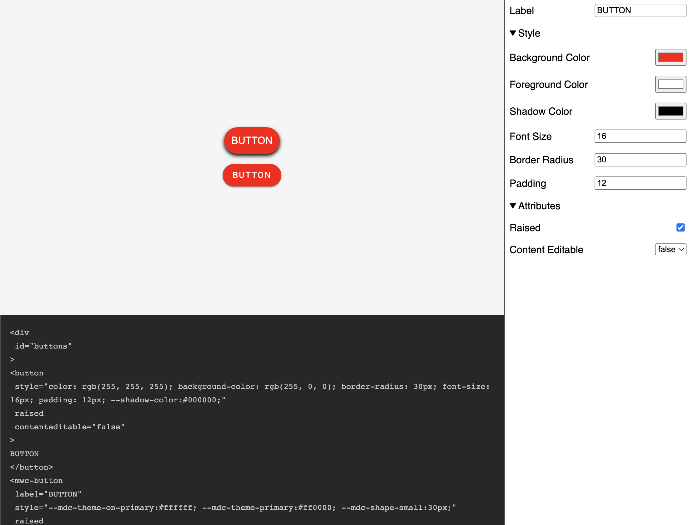
If everything worked as expected, you should see the following:
If you want to learn more about building with Lit you can read the docs here.
The source for this example can be found here.
Recommended Agent Skills
Expand your agent's capabilities with these related and highly-rated skills.
 rodydavis/skills
how-to-do-offline-recommendations-with-sqlite-and-gemini
Learn how to enhance your CMS like PocketBase with AI-powered content recommendations using text embeddings, SQLite, and k-nearest neighbor search for efficient and scalable related content suggestions.
rodydavis/skills
how-to-build-a-webrtc-signal-server-with-pocketbase
Learn how to build a simple WebRTC video call application using PocketBase as a signaling server, enabling peer-to-peer communication with SQLite on the server and realtime updates via Server Sent Events.
rodydavis/skills
flutter-terminal-cheat-sheet
This post provides a handy collection of Flutter commands and scripts for web development, package creation, troubleshooting, testing, and more, streamlining your Flutter workflow.
rodydavis/skills
how-to-print-multiple-objects-to-the-console-with-print-in-dart
Learn how to print multiple objects to the console in Dart using Records, offering a similar experience to JavaScript's `console.log()` functionality.
rodydavis/skills
flutter-input-output-preview
Build responsive Flutter apps with a reusable `TwoPane` widget and an `InputOutputPreview` component for side-by-side code and preview display on both mobile and desktop.
rodydavis/skills
displaying-html-in-flutter
Easily display and interact with HTML content in your Flutter app using the `easy_web_view` package, which supports both web and mobile platforms.
Didn't find tool you were looking for?